From the first idea to the final pixel.
I build the vision, protect it, and make sure it survives contact with reality.
The thinking and the making, together, from the first conversation to the final delivery.
Logo, typography, color, texture, tone, and the rules that hold it all together across every touchpoint. Not borrowed from a trend. Not inspired by a competitor. Built from who you actually are and what you genuinely want to say. A good brand identity does not just look right. It feels inevitable.
Some projects need a visual identity built from scratch. Others need someone to hold the creative thread together across a team, a campaign, or a production. Most need both. I work across the full spectrum of brand and creative direction, from developing the visual language that makes a brand unmistakable, to being the eye in the room that makes sure every detail is exactly right.
You like what you see?
Featured Projects:
The Clarity Protocol
*
The Clarity Protocol *
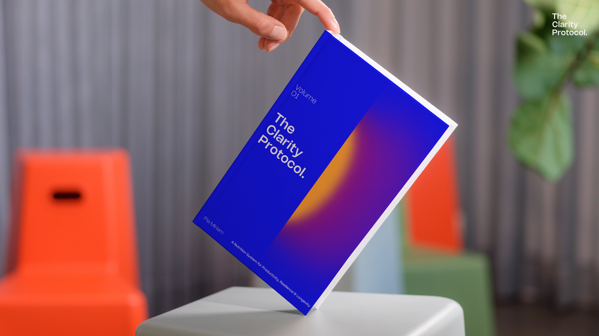
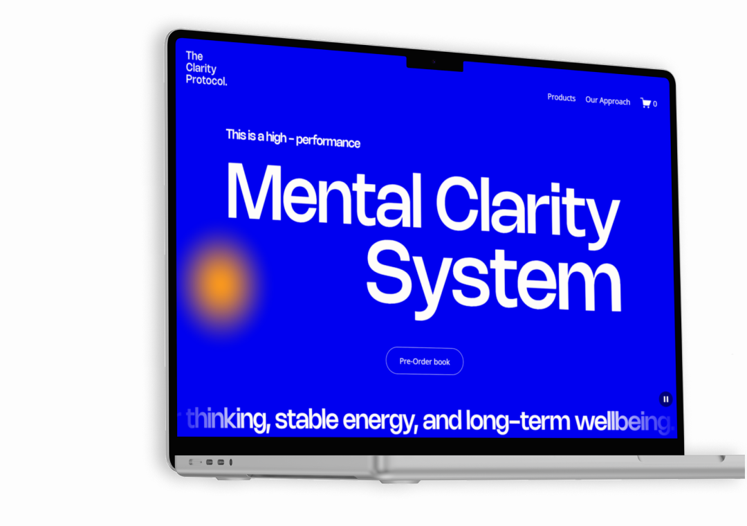
The Clarity Protocol came to me as an idea and a belief.
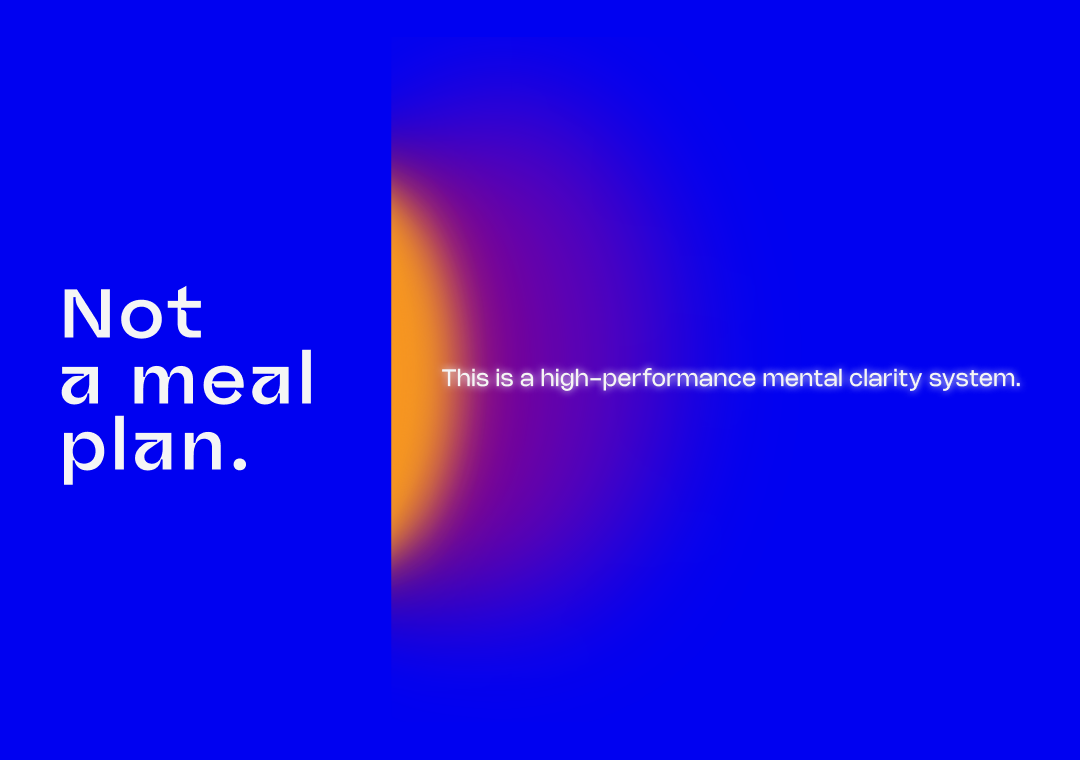
A wellness and mindset brand built on the conviction that inner clarity and bold self-expression are not opposites but two sides of the same thing. My job was to make that belief visible.
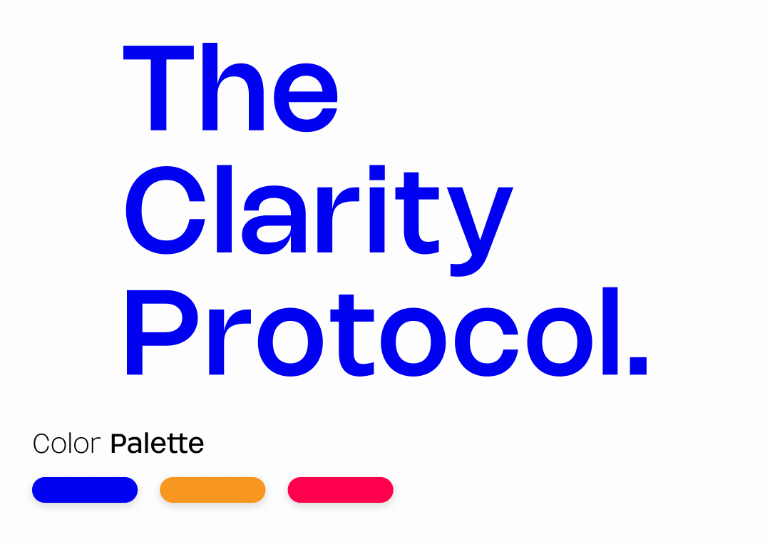
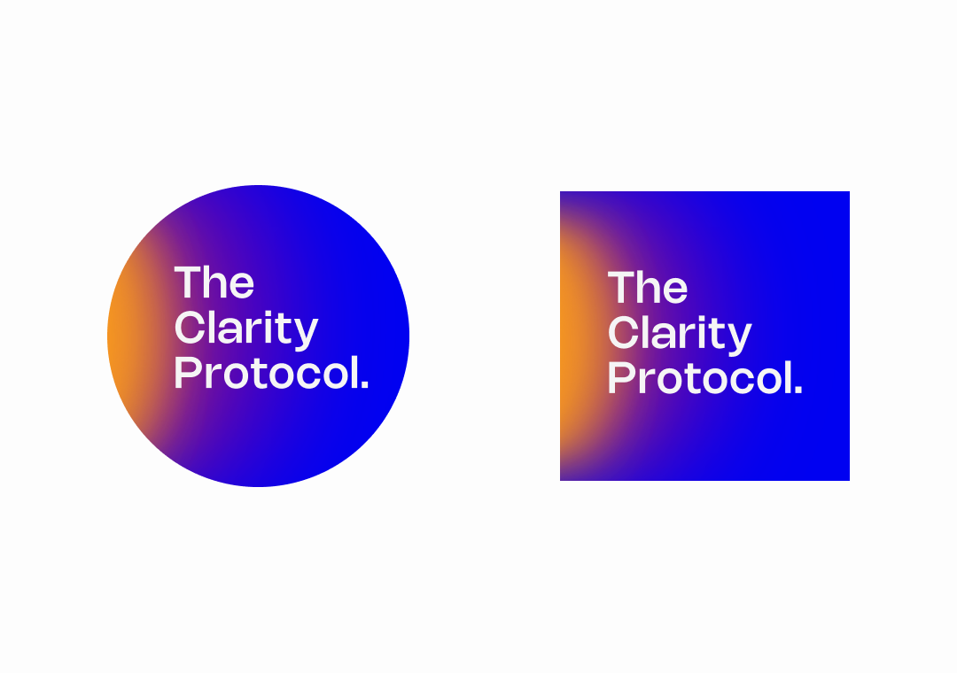
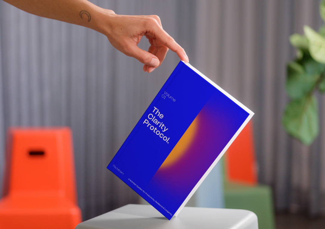
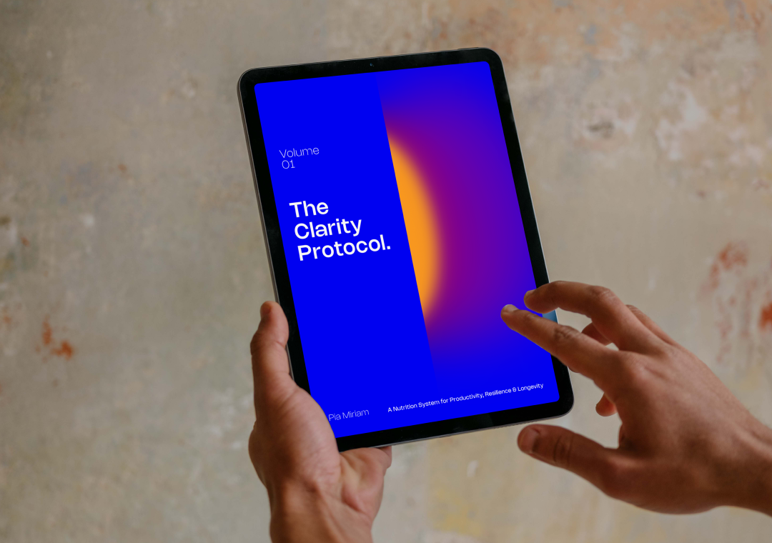
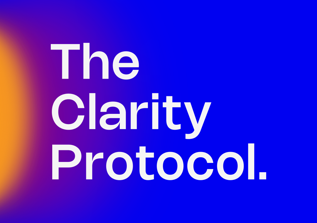
I started by developing the complete visual language from scratch. The logo system, the typography hierarchy, the color palette, the texture and material references, the rules for how everything comes together across digital and print. Every decision was made in service of one idea: a brand that feels intelligent and warm at the same time.
Minimal without being cold and premium without being inaccessible.
From the identity I moved into the digital experience. I designed the complete UI system in Figma, thinking through every page, every scroll, every interaction as an extension of the brand world. Then I implemented it in Squarespace, pushing the platform beyond its default capabilities to build something that felt genuinely bespoke.
The result is a brand that looks exactly like what it is. Considered, intentional, and unlike anything else in the wellness space.
Espacio Argén
*
Espacio Argén *
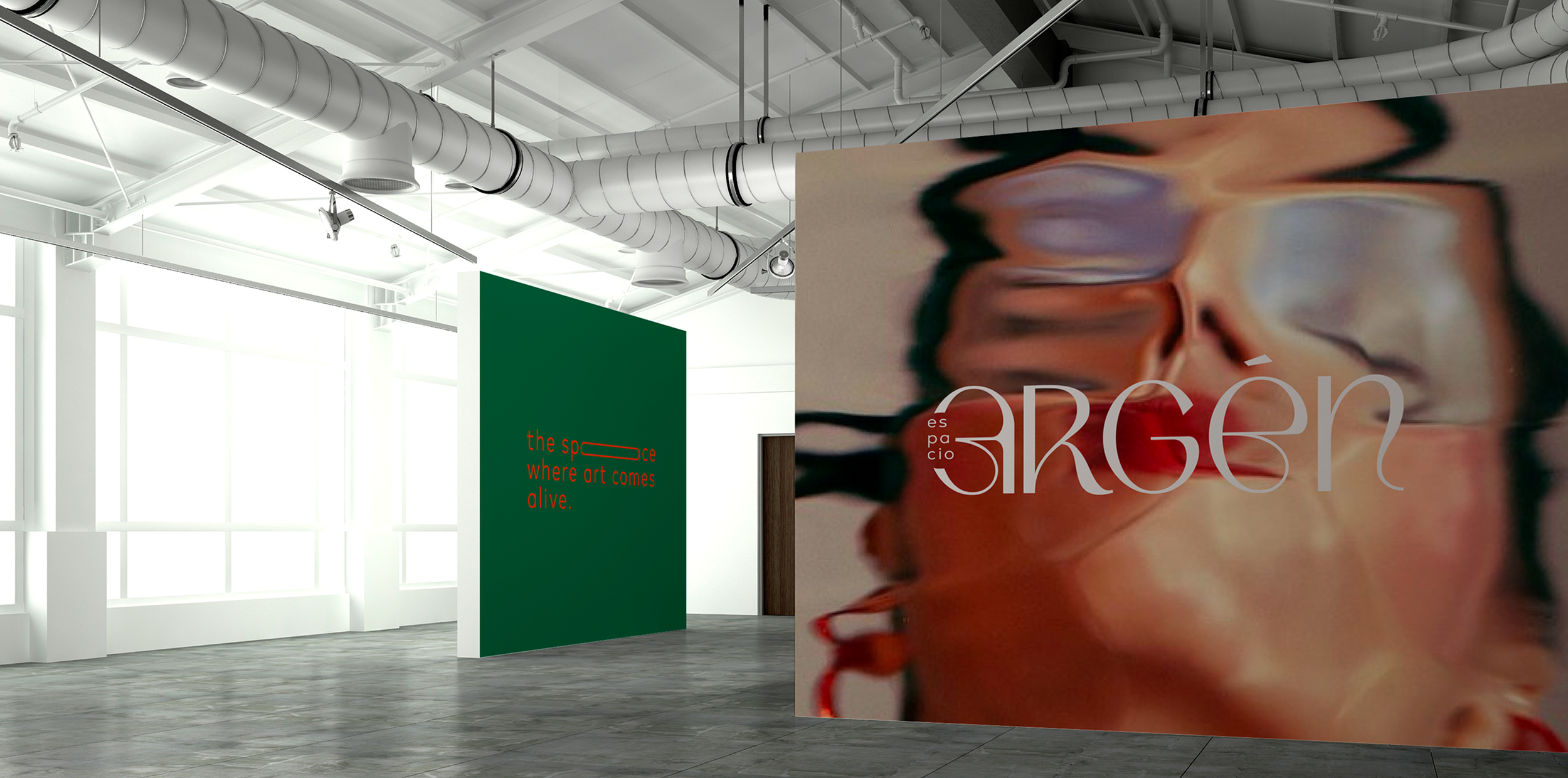
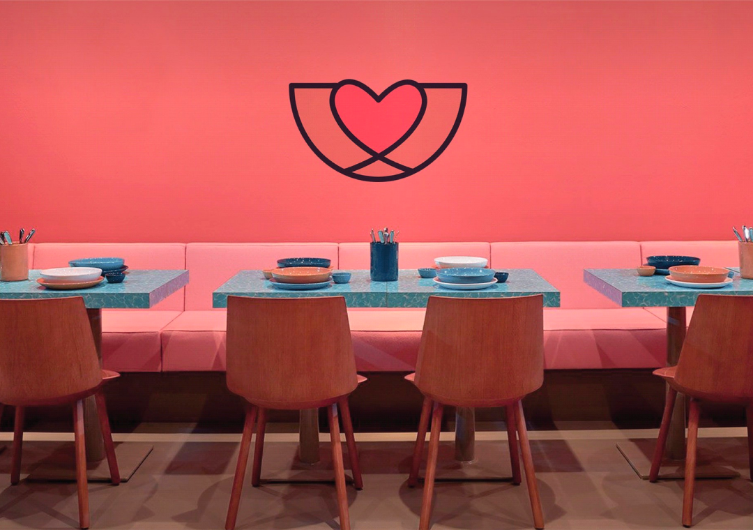
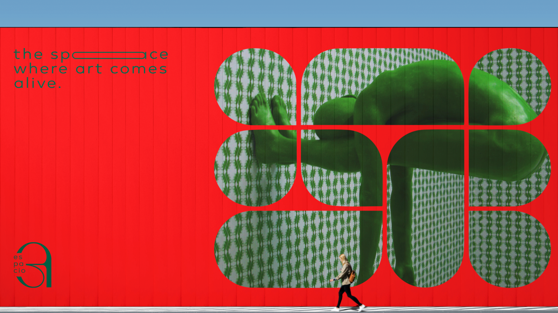
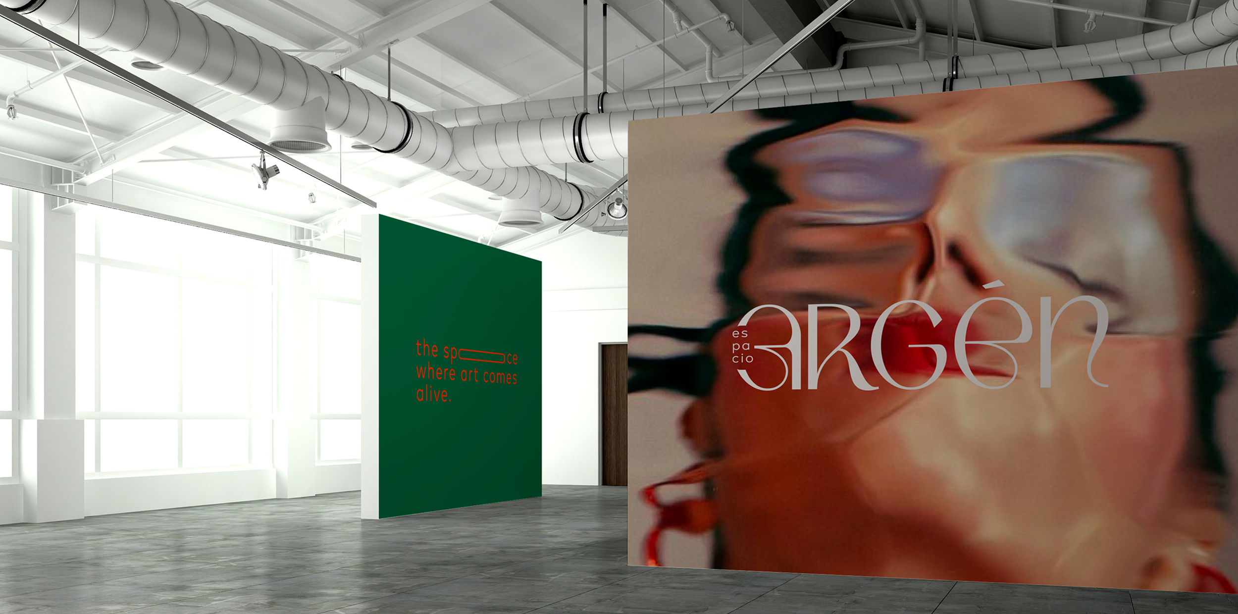
Espacio Argén had evolved. What started as one thing had grown into something more considered, more contemporary, more intentional.
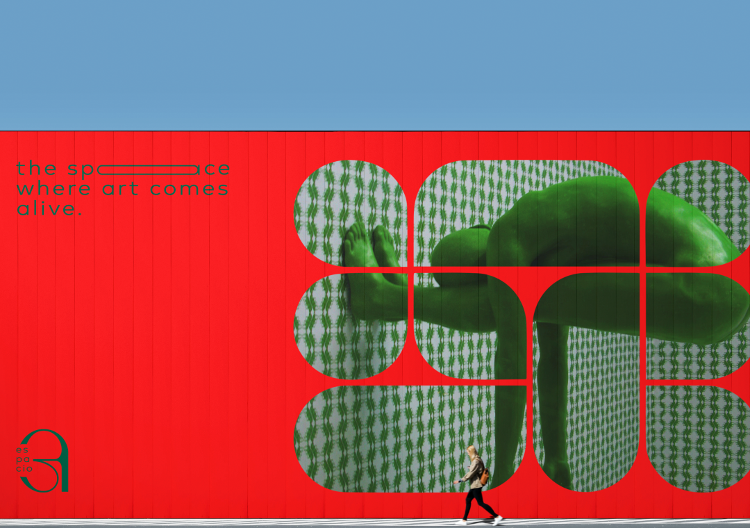
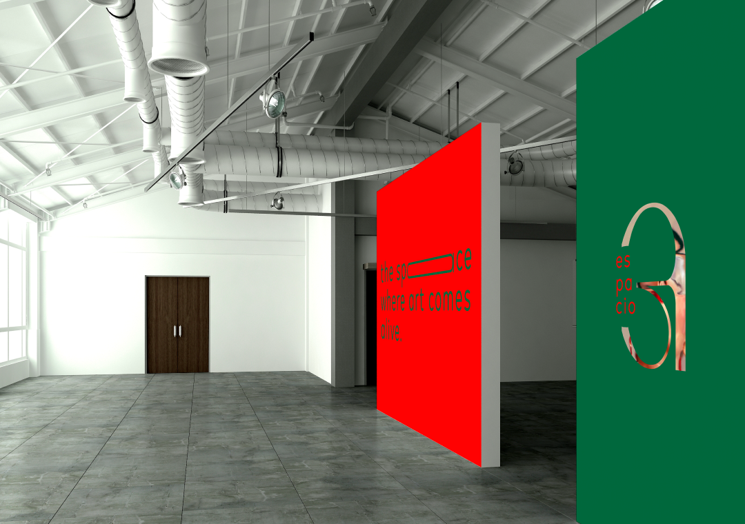
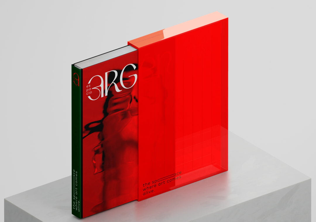
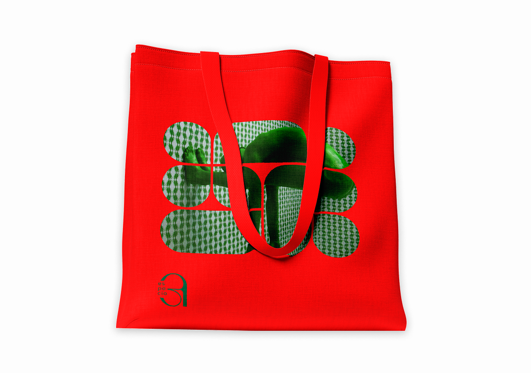
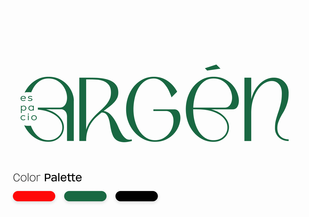
I came in to rebuild it. I worked to articulate what the space actually was before touching a single visual element. Once that foundation was clear, I built the complete brand system around it. Typography that felt architectural and warm at the same time. A color palette that referenced the materiality of the space. A logo that was precise without being cold.
The result was an identity that felt like it had always belonged to the space, like it had been there from the beginning and had simply been waiting to be uncovered

Quantum Realisation
*
Quantum Realisation *
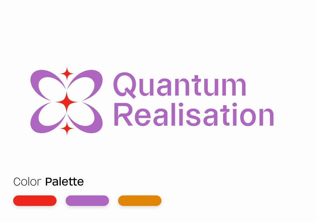
Quantum Realisation sits at the intersection of the scientific and the spiritual and needed a visual identity that could hold both without reducing either.
I built the complete visual world from scratch.
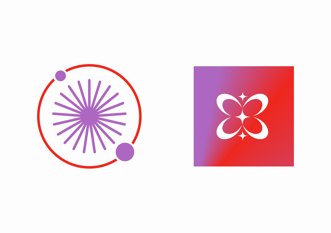
Logo system, typography, color language, and a secondary mark drawn from quantum philosophy. Every decision was made in service of one feeling: that this is a space where something real and profound can happen. Quiet, precise, and otherworldly without being inaccessible.
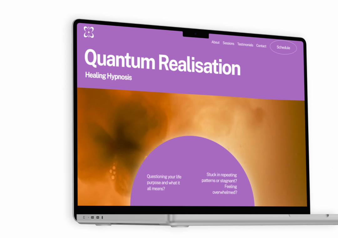
From the identity I moved into the full website design and implementation in Squarespace.
Thinking through how someone completely new to the practice would move from curiosity to trust to booking a session.
The result is a brand that you feel before you fully understand it.
Rebranding
*
Rebranding *
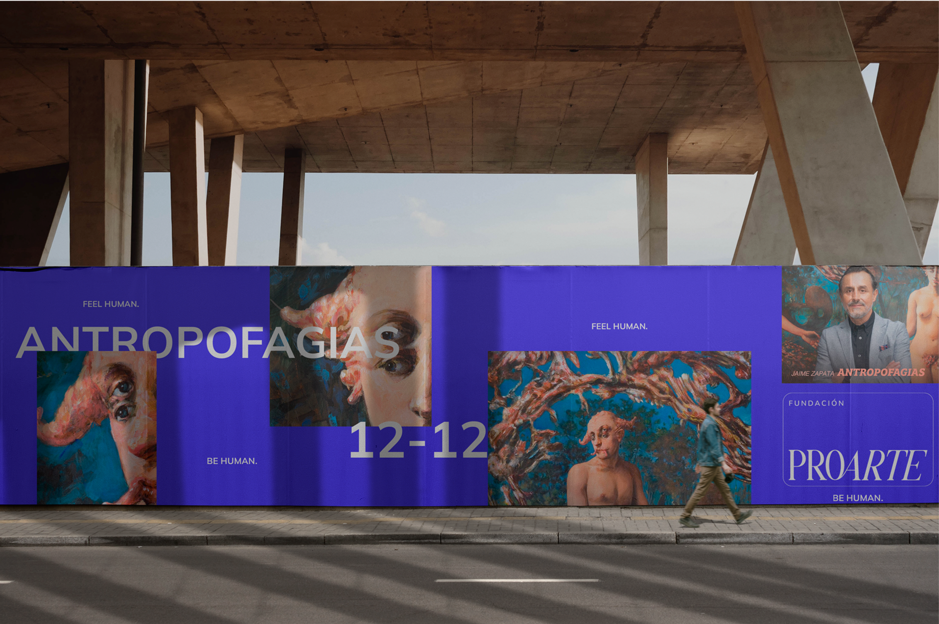
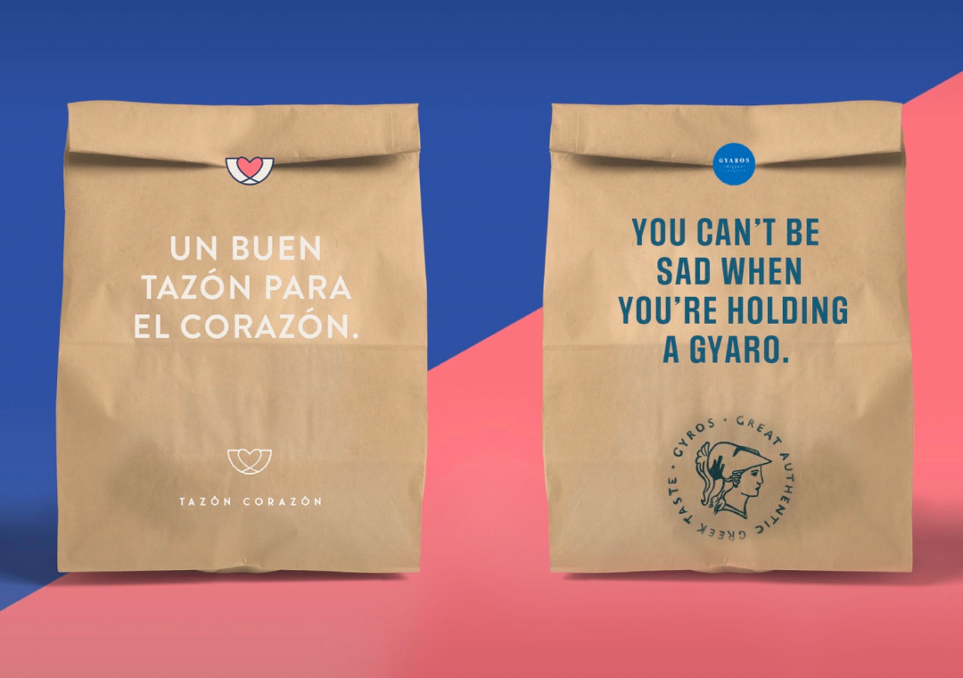
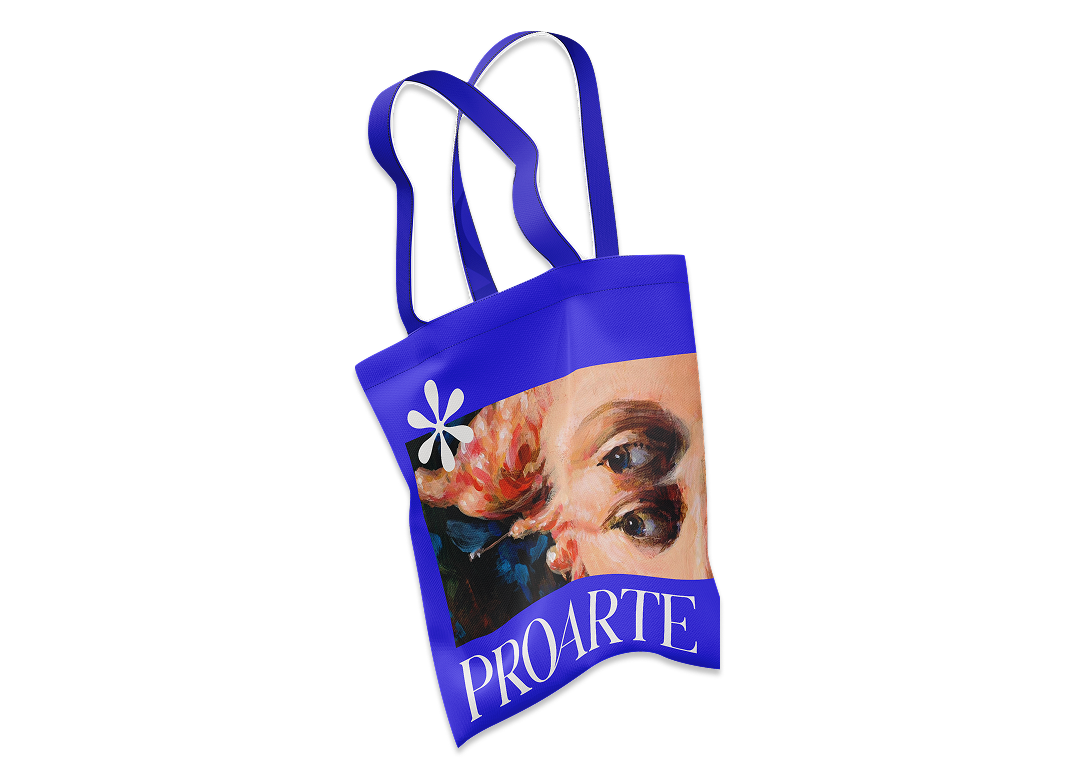
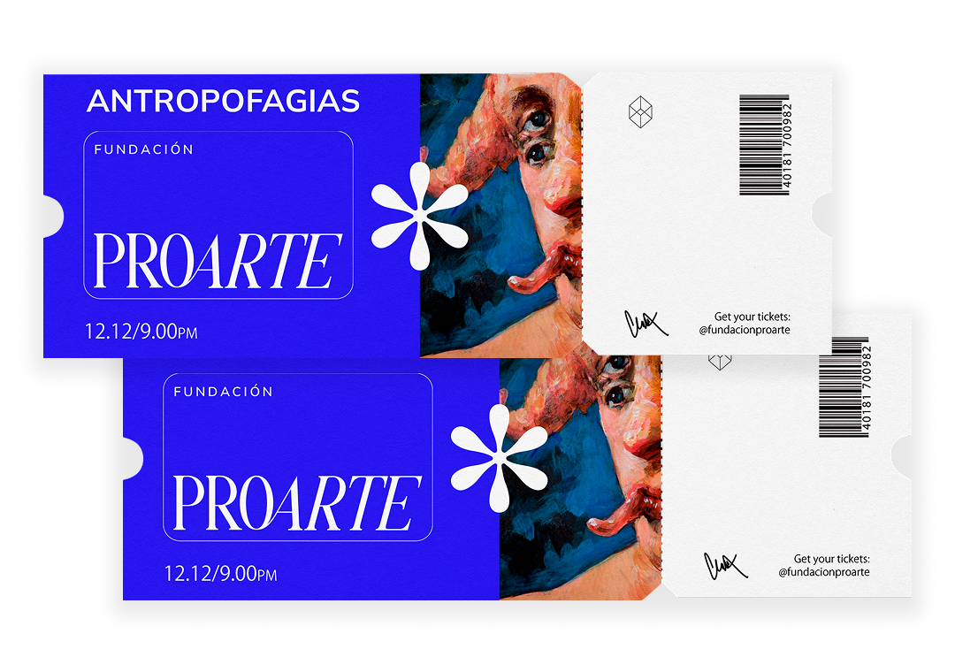
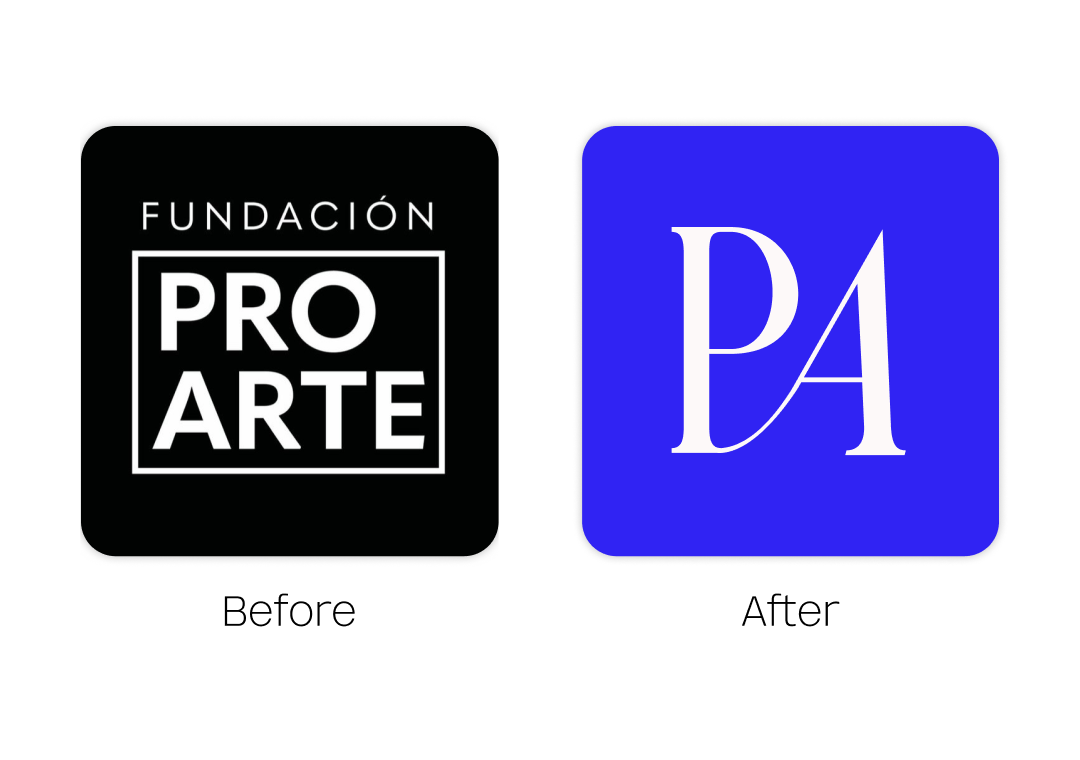
Rebranding is not about starting over. It is about getting honest.
About looking at what the brand has become and asking whether it still reflects what the brand actually is.
I work with founders and teams who have outgrown their visual identity, who have evolved as a business but whose brand has not kept up, or who simply know something is off but cannot name exactly what.
I come in, look at everything, ask the uncomfortable questions, and build something that finally feels true. No templates. No trends. Just a brand that looks like itself again.
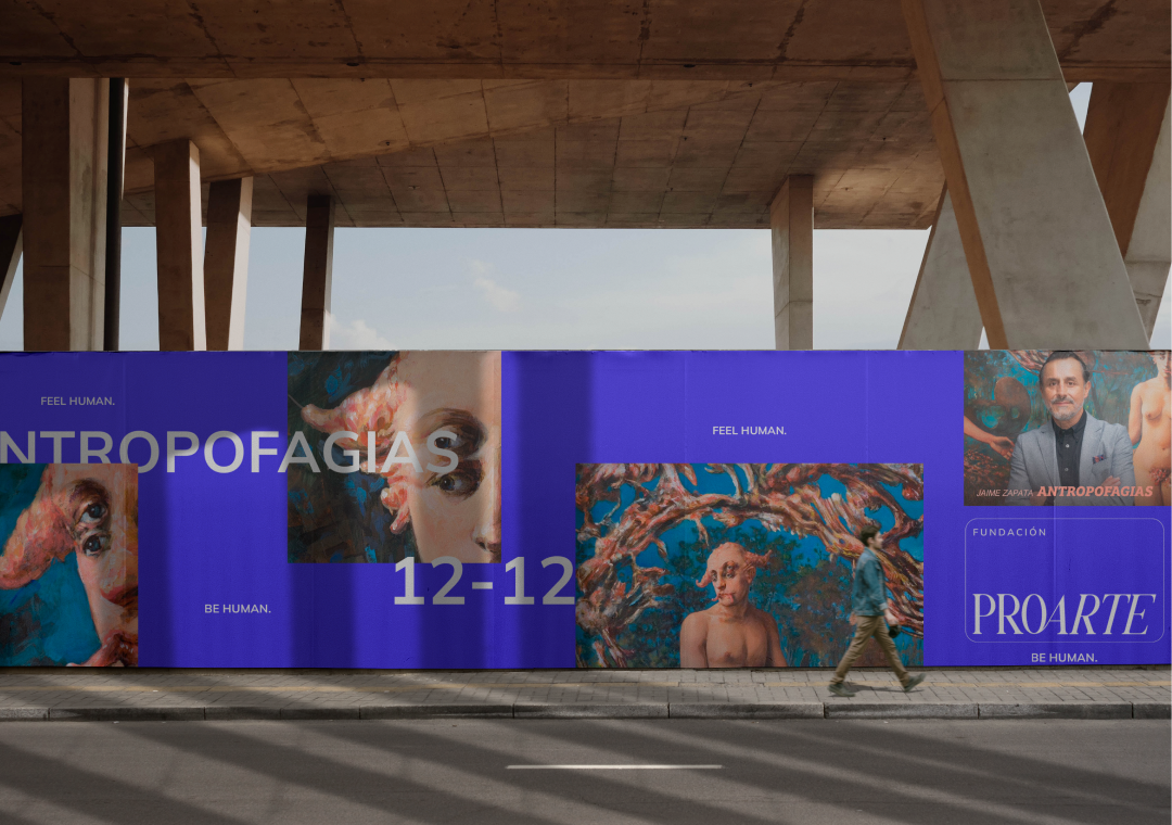
Camomilla x Xico
*
Camomilla x Xico *
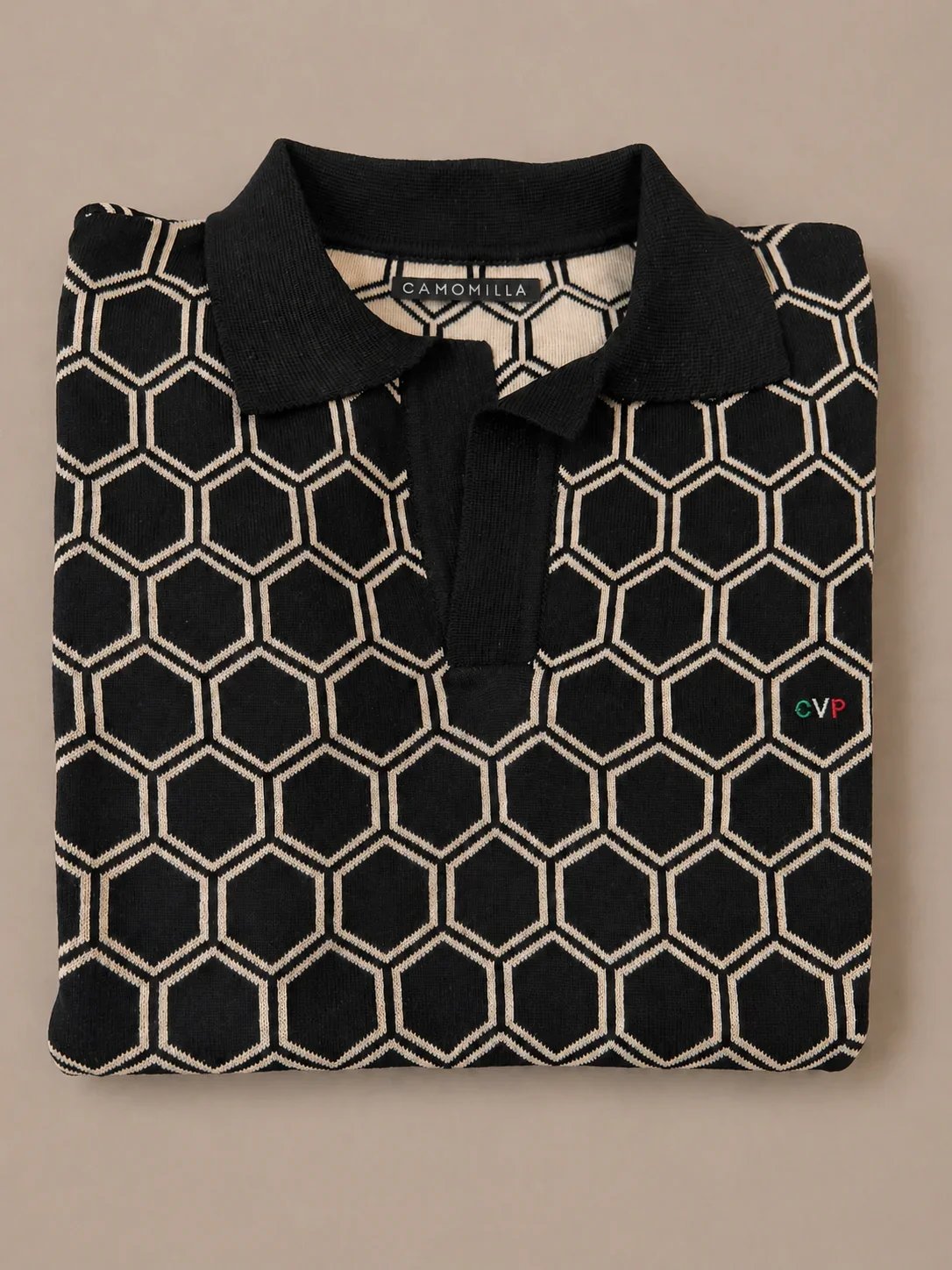
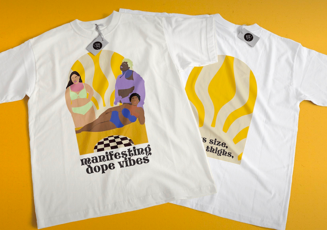
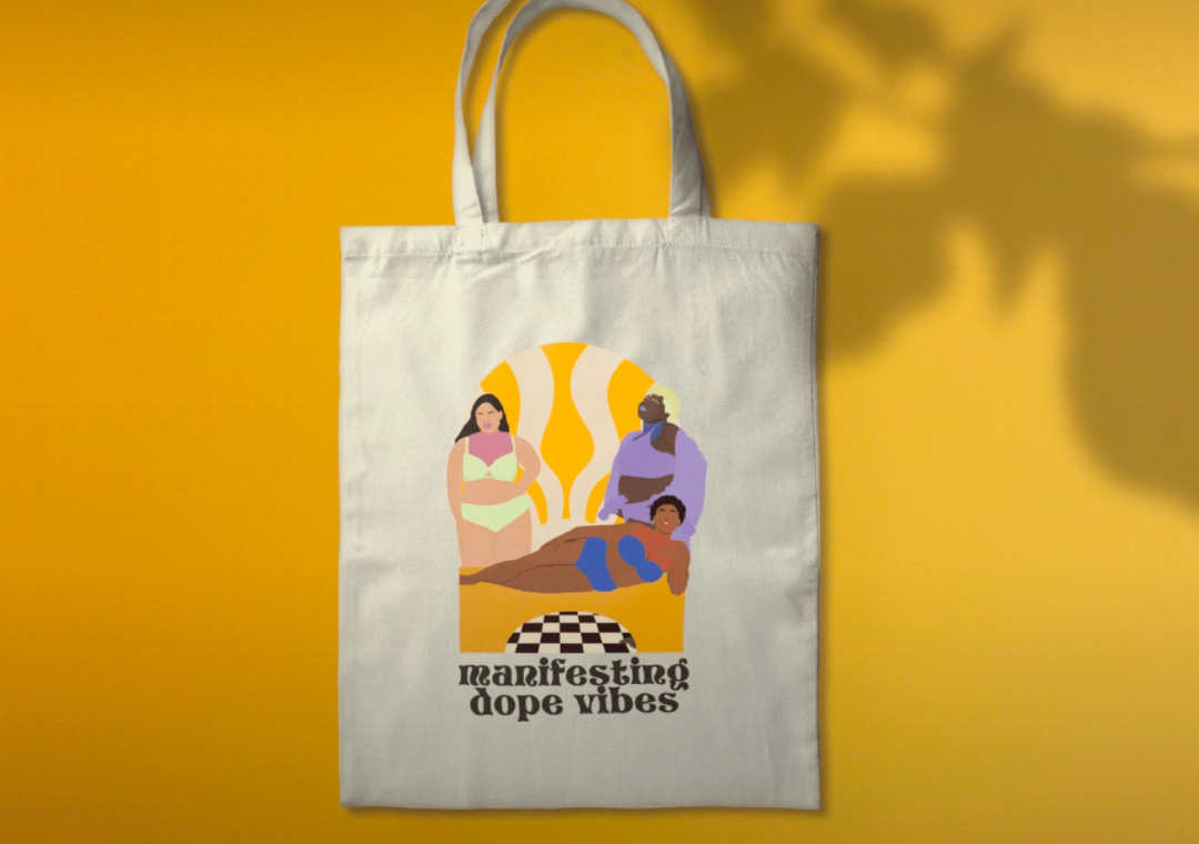
With Camomilla, the label had a strong creative identity in the studio but it was not translating into the world. The clothes said one thing and the brand said another. I came in to close that gap.
I started by understanding what the brand actually stood for. Its references, its aesthetic instincts, the kind of woman it was dressing and the world she moved in. From there I rebuilt the visual language from the ground up. New logo system, new typography, new color palette, new rules for how everything came together. A brand that finally looked as considered as the work behind it.
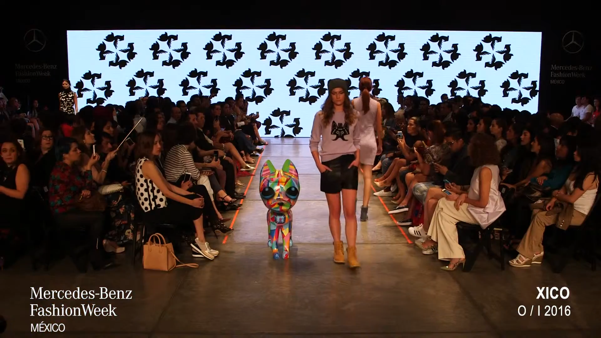
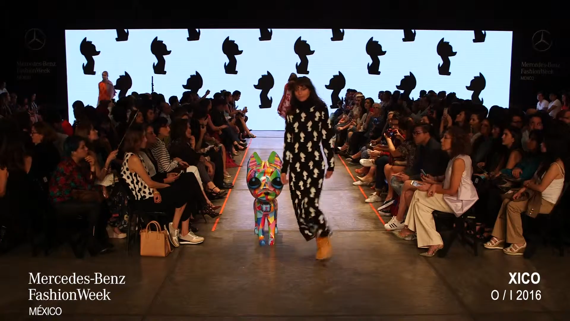
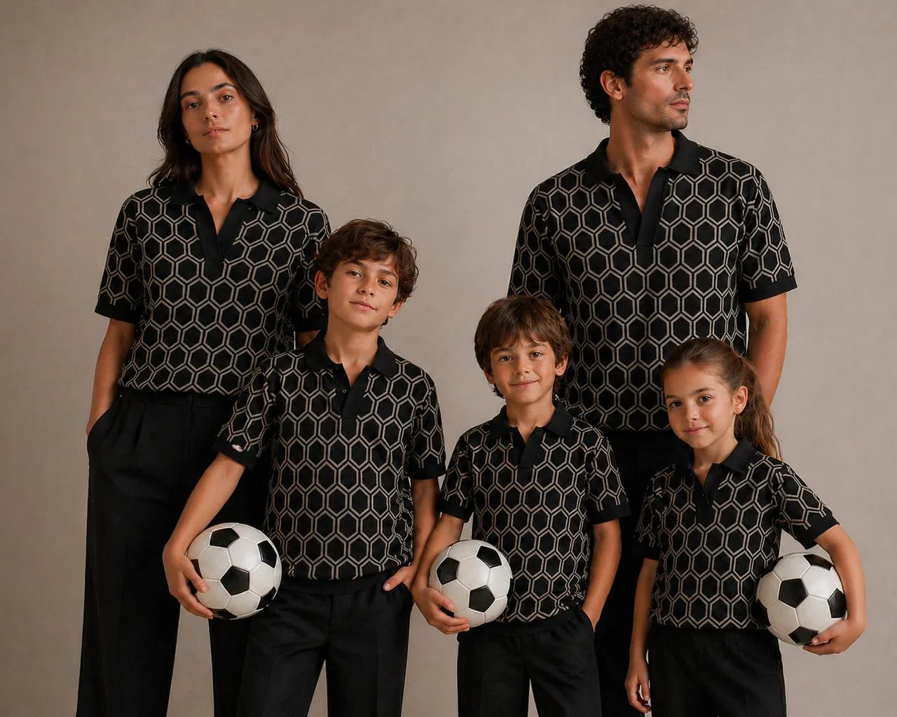
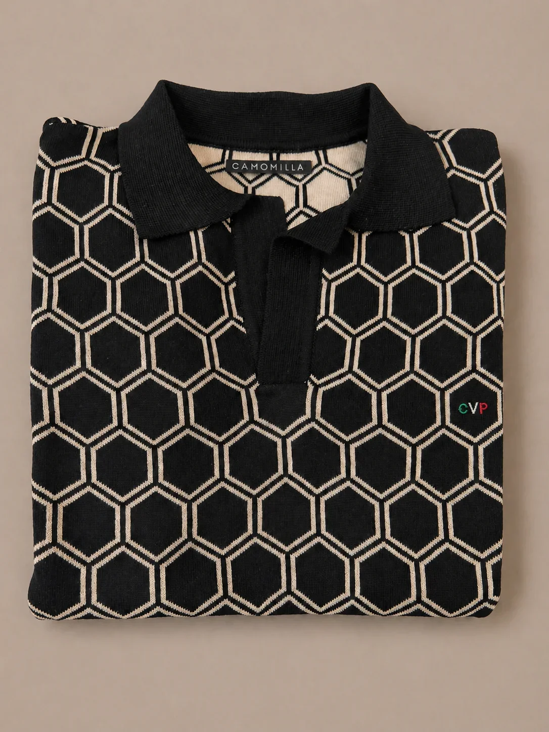
It translated directly into the textile design for the collection and into the complete production of the runway show for Mexico Fashion Week 2016. Every element of the show, the staging, the lighting, the styling, the music, the pacing, was an extension of the new brand world. End-to-end creative ownership from the first sketch to the last look on the runway.